Lessons from craft polish
Pushing on craft isn't just optimization it also helps uncover hidden states and bugs
This Saturday I spent time building Surgency, my focus tracker app with a fitness style aesthetic. Because yes, the world does need yet another tracker :) To be honest, I’ve struggled a lot in picking up building the app again, sometimes it feels like there’s so much to do and perfectionism rears its ugly head.
But the principle I like to follow is — build the skateboard, not the bicycle with no wheels and iterate rapidly. Today’s world favors moving fast and whereas in the past where building, deploying, testing was slow; this is no longer the case.
Carve the ice sculpture, then chisel
Here are the key things I worked on to make Surgency polished. Sometimes you have some idea of what to build but it’s not 100% certain. The joy of building, of being in flow is that you’re feeling your way through it. The process of creation uncovers more.
Uncertainty is part of the process. In the past I would try to strip out as many unknowns as possible because it would mean I knew my stuff—I considered every possible edge case. But sometimes you just have to get your hands dirty. Practice isn’t theory, it’s messy. You may have to muddle through it and come out the other side better for it.
Real artists ship
No matter how rough, it’s important to get things out there—as Steve Jobs said, real artists ship. As designers we usually design for many different audiences such as:
- Our users first and foremost
- Our stakeholders as well to show what the future might be
- Ourselves
And designing for ourselves is invaluable. Sometimes you need to pressure test prove or disprove certain hypotheses and you don’t know ahead of time unless it’s real. Ok enough theorizing—here’s what this meant in practice.
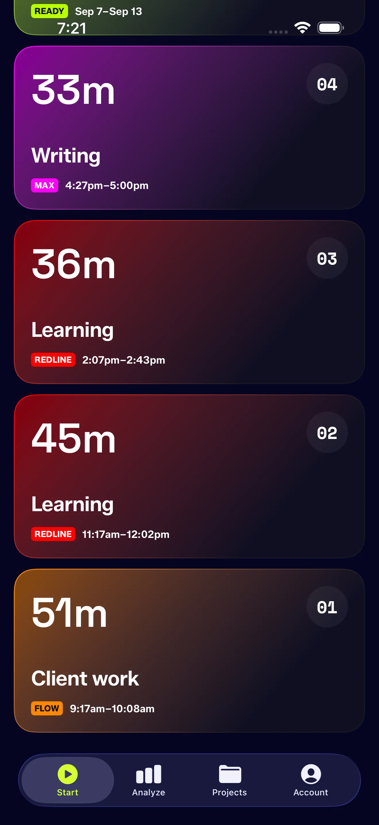
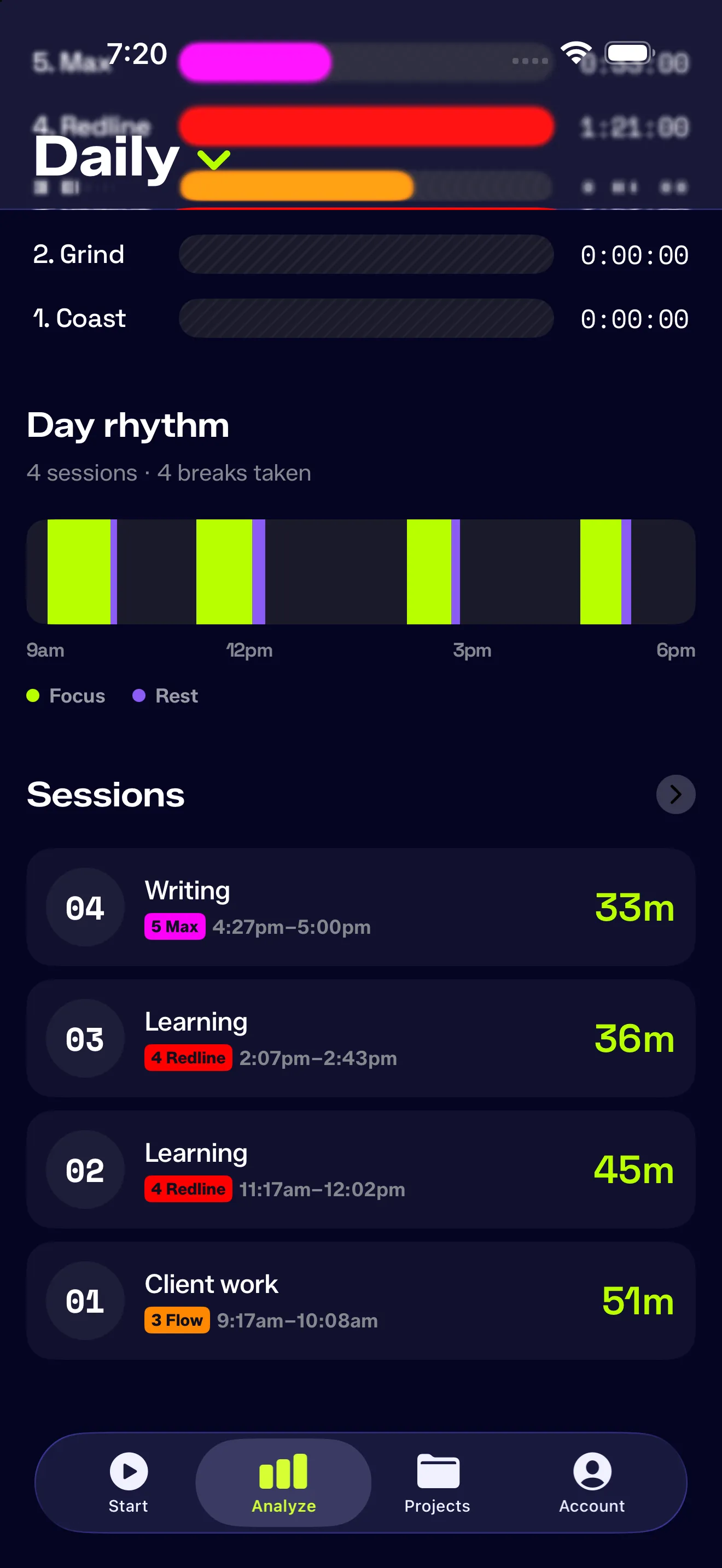
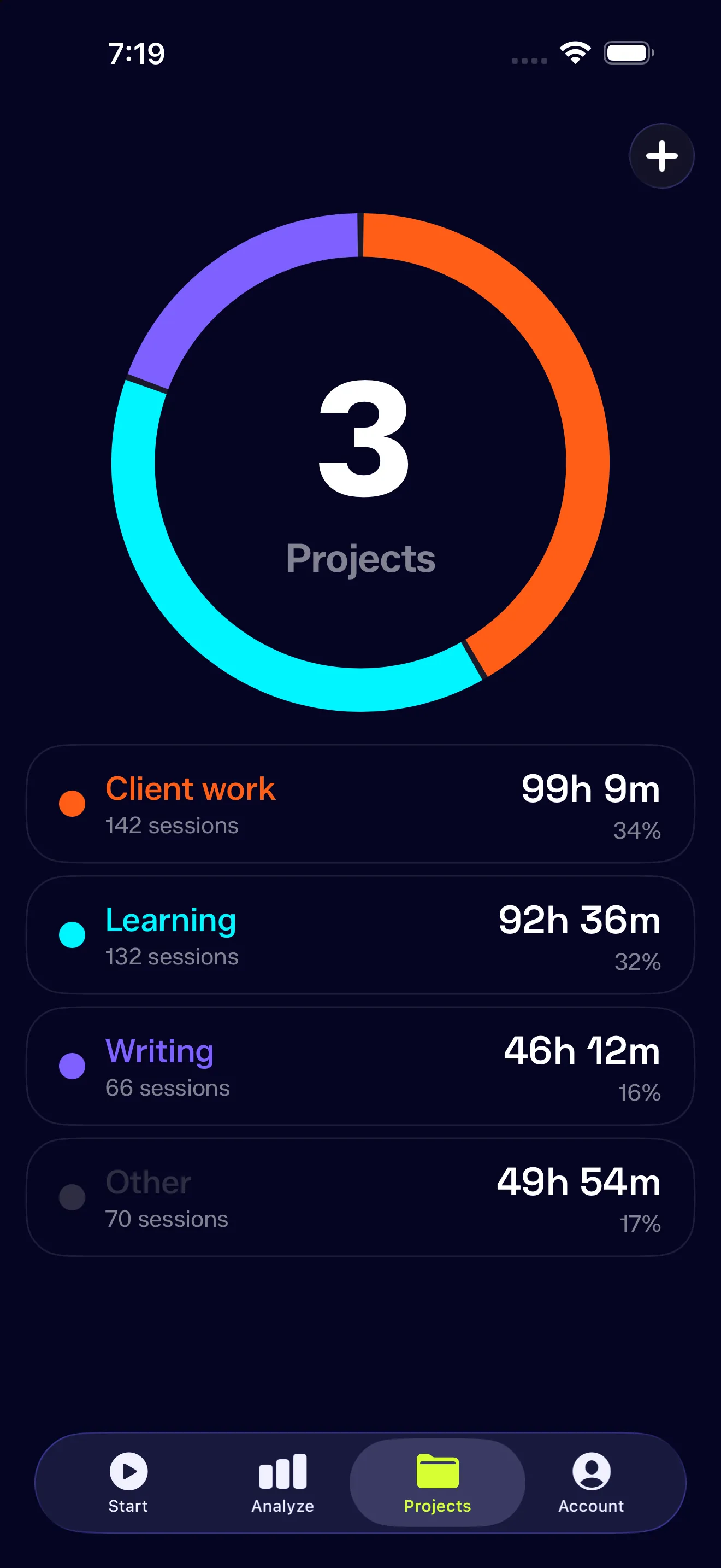
One thing I was looking to polish is to unify the UI for tracked sessions. Initially I started with small compact view on the Analyze page, tried to retrofit this in projects but considered a different pattern on home. There was definitely design drift so I wanted to pressure test some options to consolidate. Color means something different on each screen: effort vs project. Where I landed — one row with effort being the most prominent.
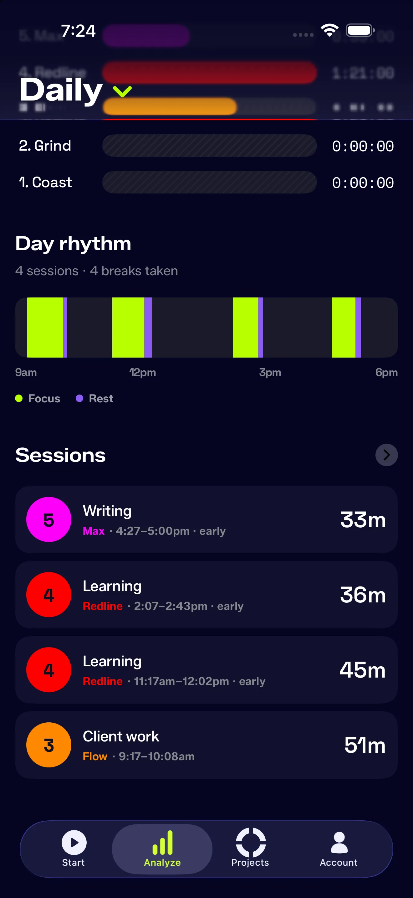
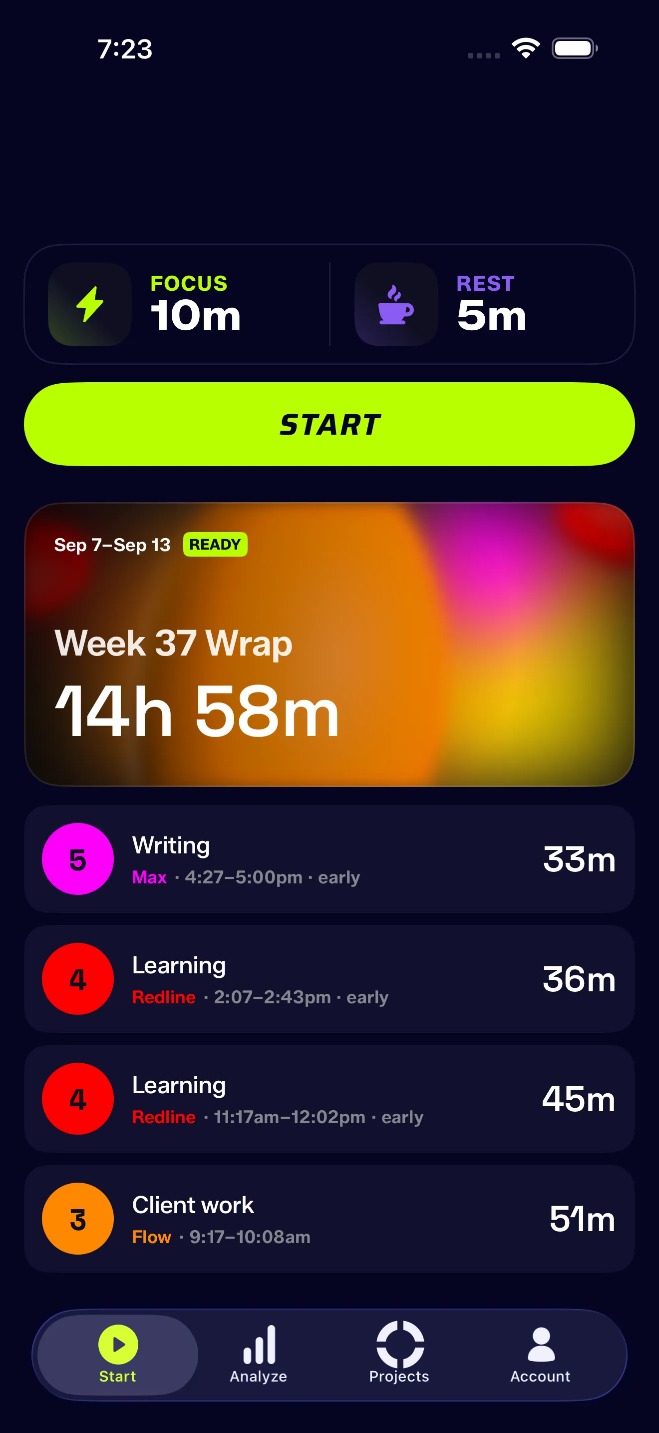
Additionally there were some other benefits in hierarchy. Putting the rows right below the weekly wrap establishes the right hierarchy to see the most stats over the past week — what were the victories and the challenges you’ve tackled? Having one tappable card makes it enticing and you can still reference the previous sessions right below it.
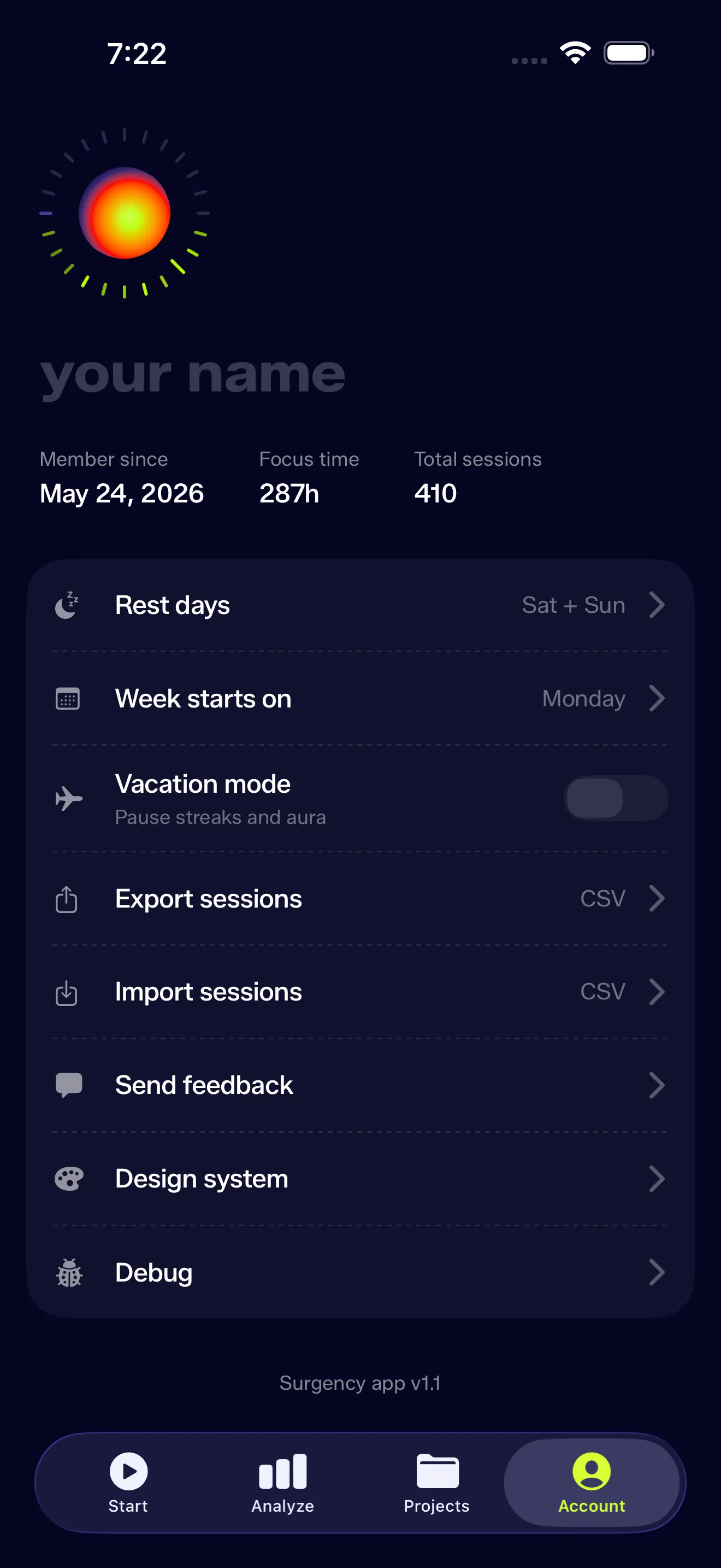
From Settings to Account
Not gonna lie — I struggled with this one. At the moment Surgency is primarily offline only, there are no other connections but I still wanted to feel the app personal regardless
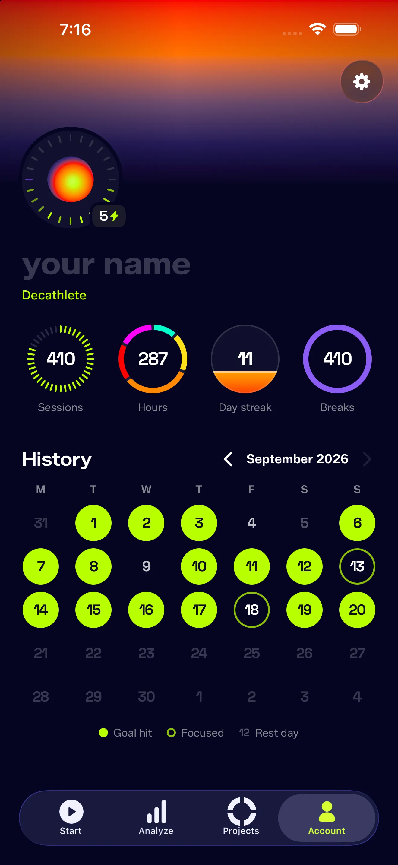
- Sessions tick toward the next rung: 1, 10, 50, 100, 250, then every 250
- Hours split by effort zone, so the ring shows what your time was made of
- Day streak rises toward your own record, not some arbitrary target
- Breaks as a share of sessions
Under the dials sits a History month calendar. It lights a day solid when you hit the goal that day’s first session confirmed, rings it when you fell short, and dims rest days along with anything before you started.
Making effort felt
I also added a mins / session switch in Analyze. Minutes tell you how long you worked. Sessions tell you whether you hit the goal you set. So the switch moved to Weekly and Monthly, where each day becomes a column: its goal standing behind in gray, the sessions you actually did in front in lime, and anything past the goal turning overtime magenta.
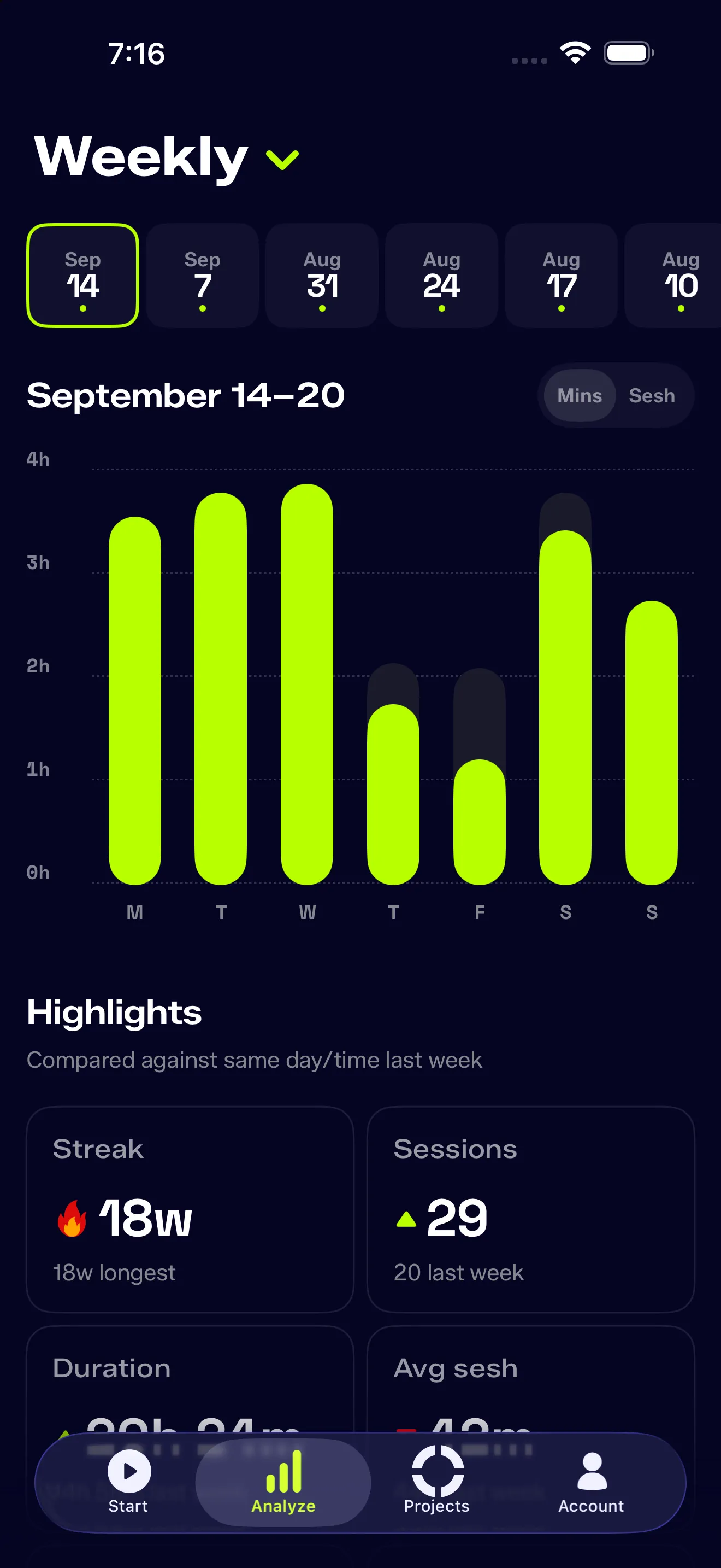
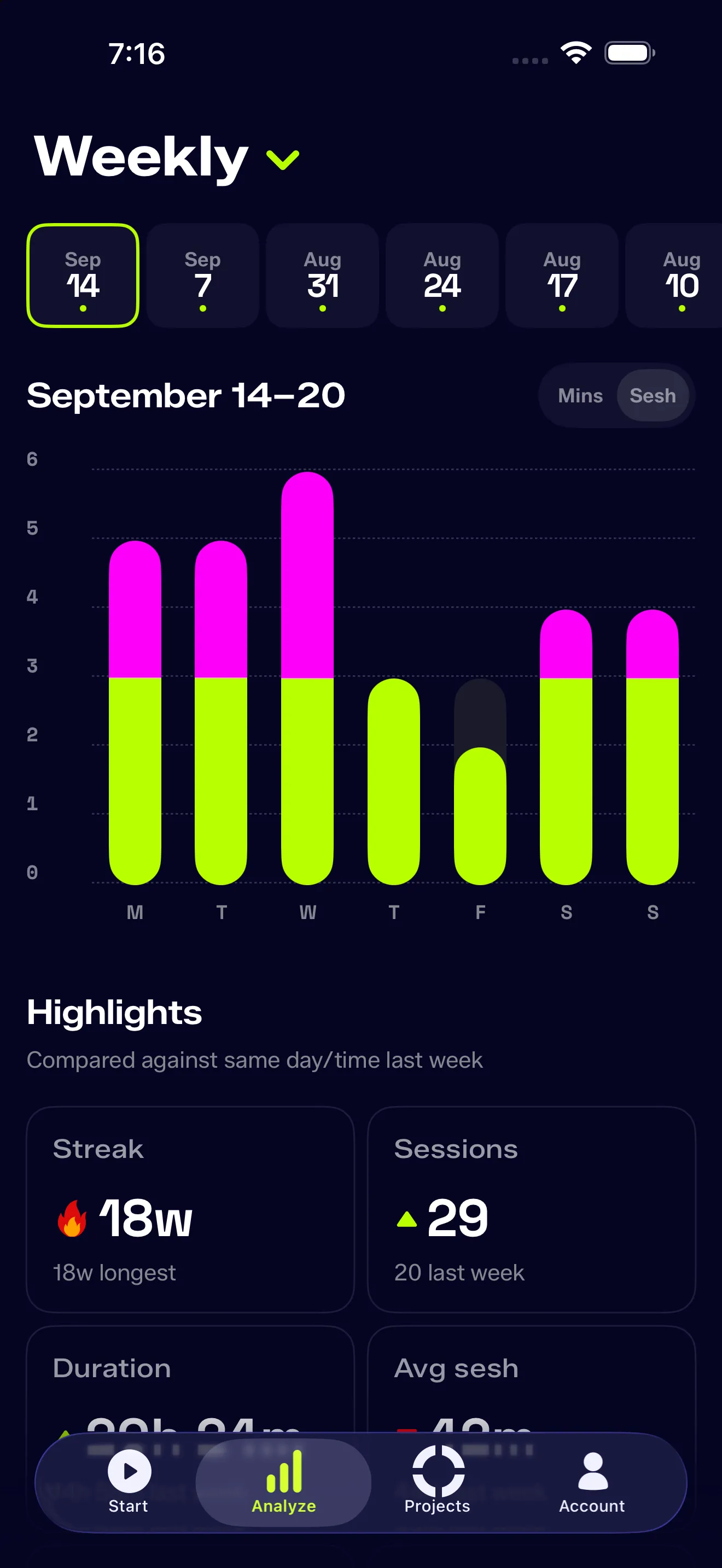
Rest days count now. There was a bug where the weekly chart used to skip the bar on any day you’d configured as a rest day. So a Saturday you worked anyway simply vanished from the chart, while its sessions still counted in Highlights, Projects, Zones and the history list.
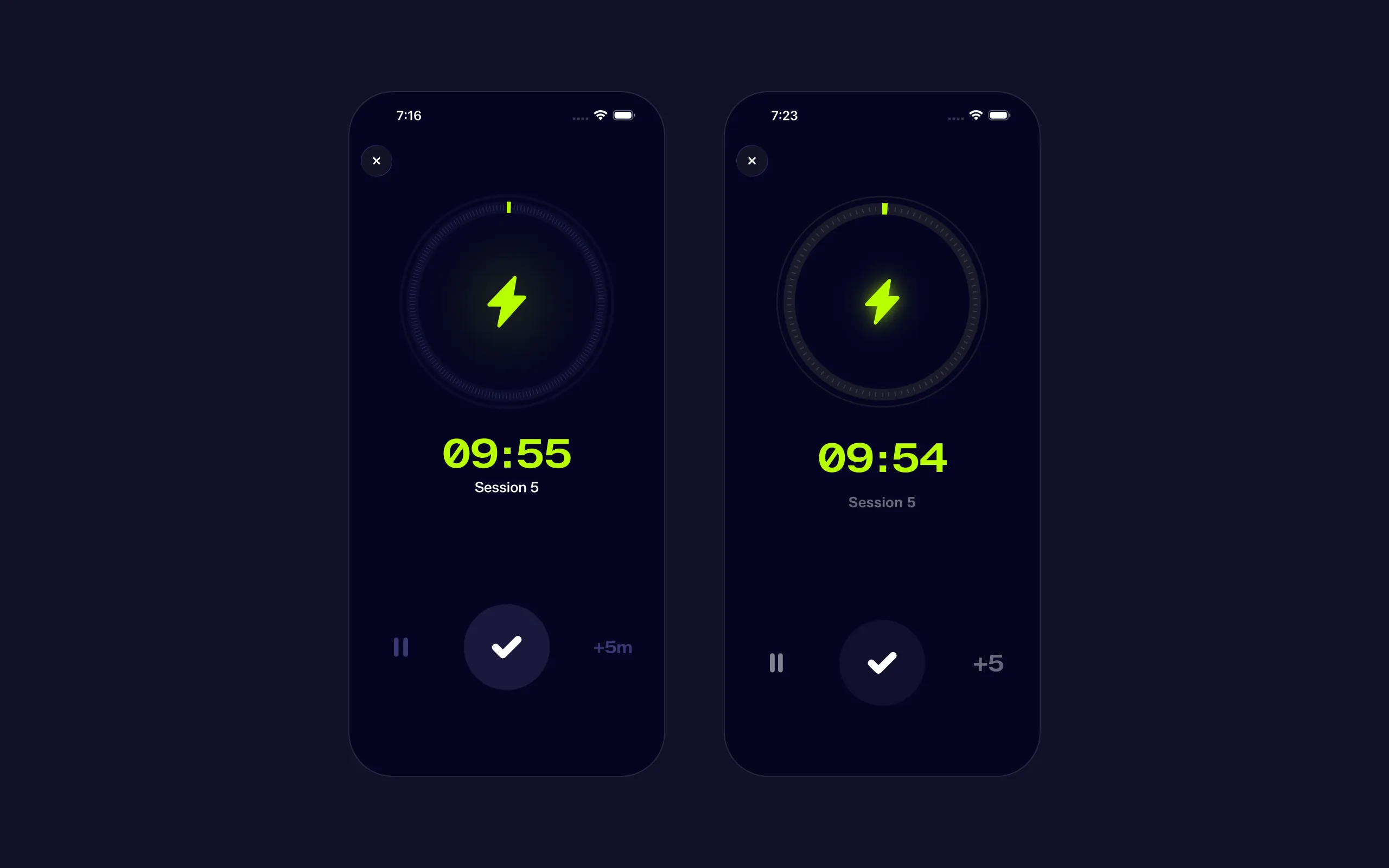
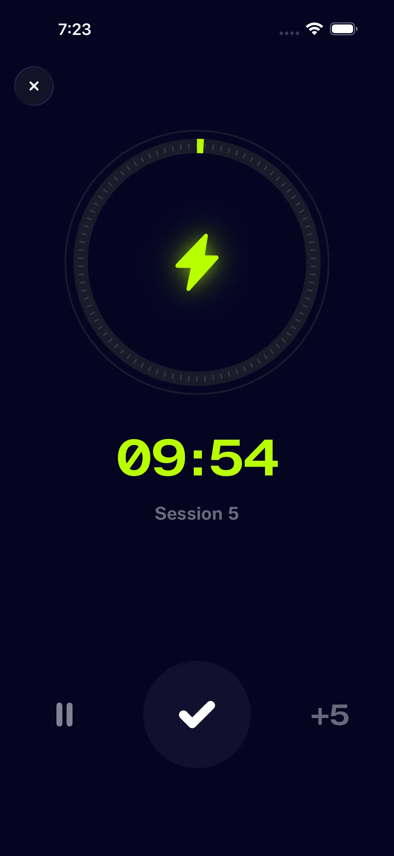
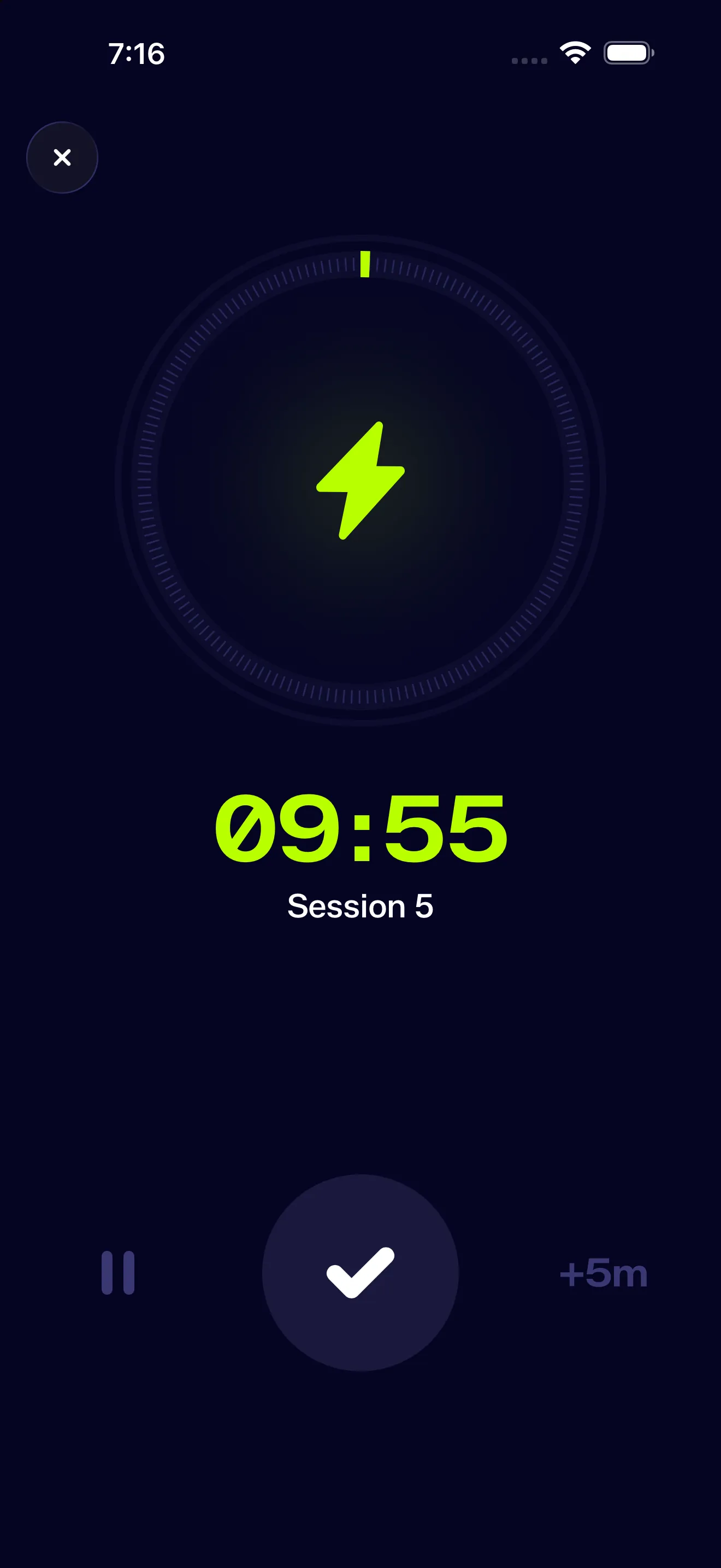
The track color. I moved the rim and track off a neutral gray onto #0D0C2C—a color tinted with the background. As you can see the difference is pretty clear.
Crafting is bug fixing
I have a difficult relationship with craft. Craft isn’t end all and be all—the world’s awash with products that look and work great but nobody wants. That said, there are benefits to being a better crafts person.
As shown here, yes the improvements fine tuned the app (optimization) but they also forced me to pay attention to other things that I’ve glanced over. It was the act of looking fixing, testing, discovering new issues or bugs, fixing, and breaking again that made the app stronger.
And the good news it that it’s never over. Any app can be improved. And in my case, looking for visual drift helped me uncover a whole host of issues that I didn’t foresee.