Designing for Google Glass, part 2
Using core design methods to solve problems on new platforms
This is the last part of a two-part series of Designing for Google Glass. In this part I’ll go deep on the process I used to design a rating system for Glass.
If you’re considering designing for new and emerging platforms—I hope this article inspires you to take the leap. At its core, the design process is similar regardless of technology. But with new hardware there are usually few rules in place giving you the freedom and opportunity to shape the future.
Glass at a glance
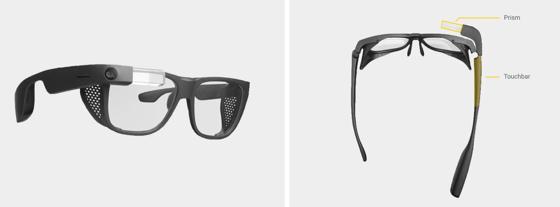
To understand Glass we must first examine its hardware. The Glass UI is projected on a tiny transparent display called the “prism”. The prism doesn’t block the viewer’s direct line of sight. As a result, the user can be fully present with the physical world while Glass can provide information in the periphery.
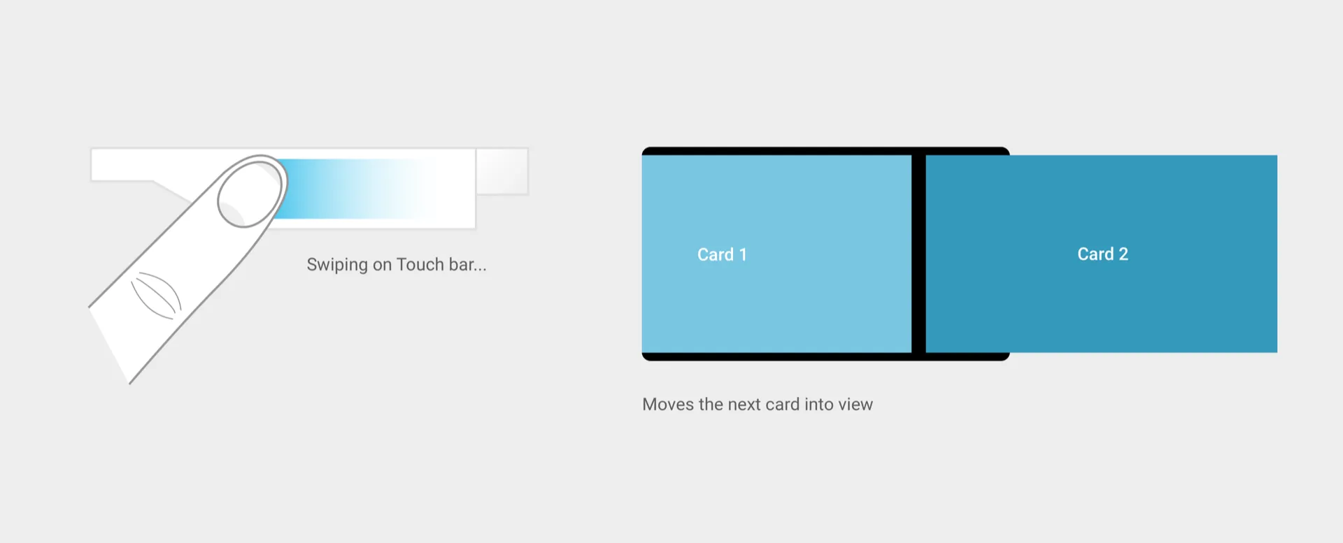
Most user interactions on Glass occur through touch via the Touch Bar located to the side of the unit. The Touch Bar supports a variety of gestures. Some of these are not unlike gestures found on a mobile device, e.g. tapping or swiping.
Navigating Glass
Navigating Glass is not unlike going through a deck of cards. Imagine a stack of cards in front of you that you can move horizontally by swiping back or forwards. You can also navigate the stack vertically by swiping up or down.
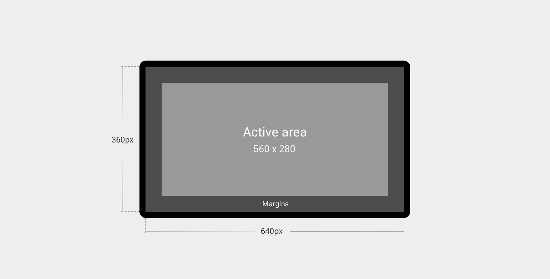
The prism UI is small. Excluding margins, the active area of the screen is 560px by 280px. This size is similar to that of an Apple Watch face. The main difference is that Glass isn’t a high-density display, so every pixel counts.
Regardless, Glass is an impressive piece of technology and with the new release last year it is more powerful and lighter than before.
Now that you know a little bit about the hardware and how it works, here’s an inside peek into my approach. During my stint at Augmedix (the company that uses Glass in healthcare) I had the opportunity to redesign a rating system that allowed doctors to rate their service using Glass.
Getting to the ground truth
To kick this project off the product manager and I interviewed executive stakeholders, account managers and of course the doctors themselves.
Here’s what we learned:
Seeking the trend. Executive stakeholders wanted to see macro trends with the ability to drill into specific regions. They wanted to know if the service was getting better? Which locations were performing well? The ideal deliverable would be a dashboard or a weekly report.

This service is 5 stars and then I quit. From account managers, we discovered that Glass ratings was just one channel for feedback. Some doctors rated their experience 5 out of 5 continuously until they suddenly stopped using it. In general, account managers checked in on the doctors via emails, phone calls and in-person visits.
My average is not your average. From interviews with doctors, we discovered their ratings were idiosyncratic. Some thought a 5 out of 5 service was average while others thought a 3 out of 5 service was average. There seemed to be no consensus among the population.
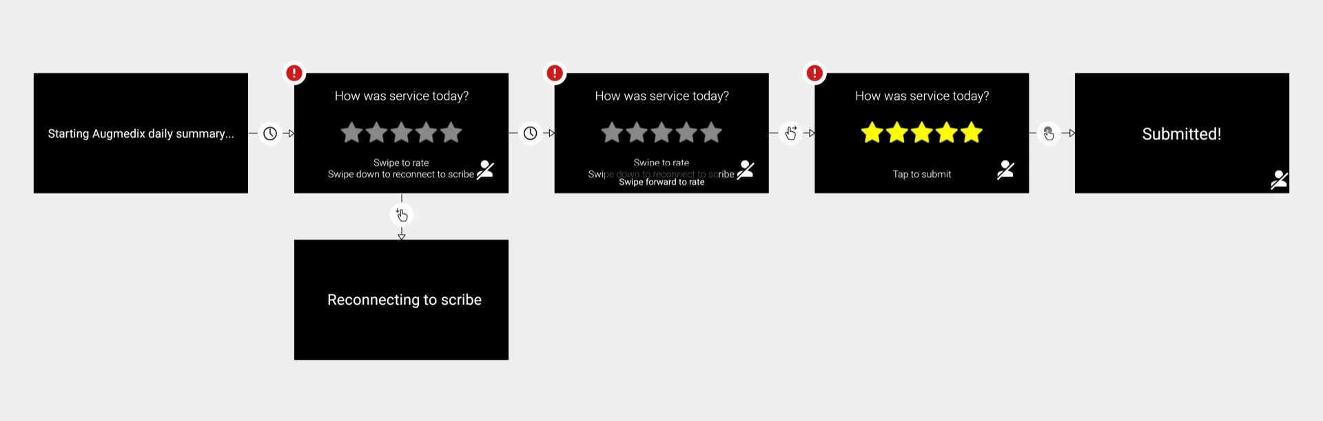
Walking a mile in their Glasses. To understand the issues firsthand I put on Glass and tried out the rating system. Submitting a rating proved error prone. This was corroborated by doctors many of which accidentally submitted the wrong rating and as a result left an audio recording saying which rating they wanted to submit instead.
What’s the root cause? I also talked with scribe managers who oversee the remote experts operating behind Glass. The managers mentioned they wasted days trying to solve an issue which they thought was due to a scribe only to discover that it was actually a technology problem, e.g. a Wifi disconnection. The star system was too general to capture this nuance.
Generating solutions
Reviewing analogs. As I started jotting down ideas for how we might approach this problem I took a look at obvious analogs such as ridesharing services like Uber and Lyft taking note of their flows.
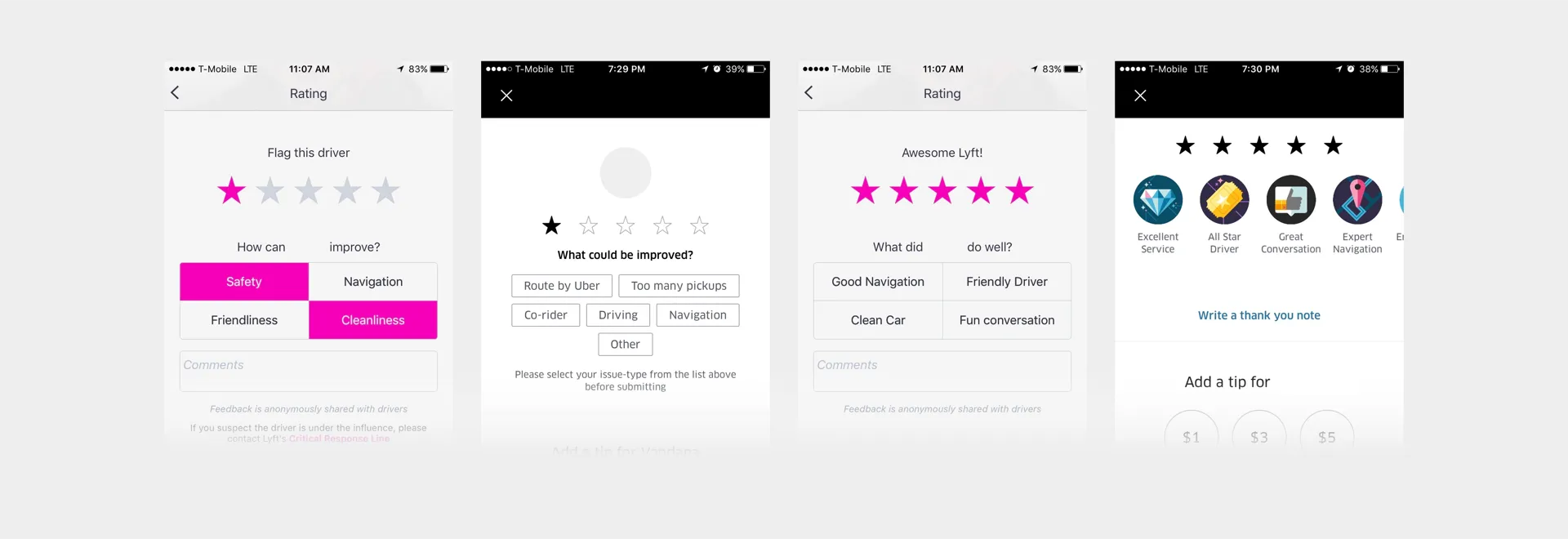
From research we knew that specificity of feedback was key. But how specific should we get? How much is too much? What if all the extra steps would cause doctors to stop submitting feedback altogether?
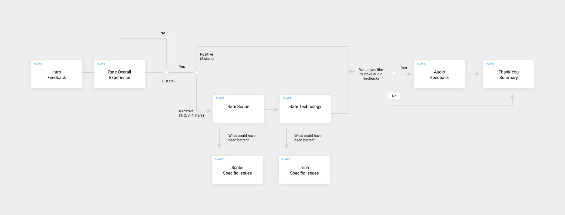
I’ve explored flows similar to the ridesharing services where a less than the ideal rating would allow doctors to provide feedback from a general list of options. In the end, I simplified the model so that the doctor could rate the scribe and tech individually and leave an optional audio recording.
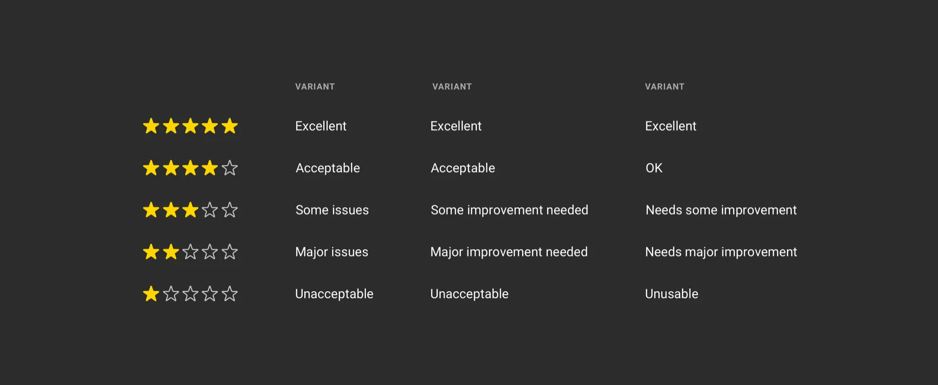
Standardizing copy
Getting the UI copy right was key. As mentioned previously, doctors didn’t know what 3 stars or 5 stars meant. But what did it mean for us?
Is a 3-star rating average? What service do we want to provide as a company? Are we ok with being in the middle? This principle led us to a scale where 5-stars = “Excellent” but 3-stars = “Below Average”.
Since the Glass UI had a limited amount of space we opted for copy that was: concise, specific and reusable in order to rate both the technology (Glass, connectivity, etc) and the scribe (accuracy of notes, responsiveness, etc).
Prototyping and testing on Glass
Unlike many platforms today — Glass doesn’t have a robust prototyping tool. To get a sense of how the UI would look on Glass I used an image feature which allowed me to send images to Glass using my computer. This was of course not a prototype, but it was useful to get a sense of how light or dark the image would seem when it’s actually projected on the prism.
In the end, I was able to build a case for prototyping multiple concepts and have the engineering team build them. In part this was due to good timing and resources. This was a new process for the company at the time. Previously features would be shipped quickly and the testing would occur later as is the case with many startups.
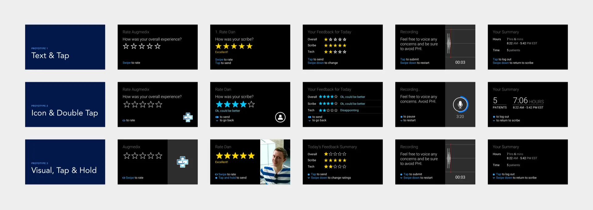
Since scheduling interviews with doctors proved challenging, I opted to test the prototypes internally. I recruited 10 employees with various levels of experience using Glass. The group’s experience level was similar to our doctor population. Each participant went through three prototypes.
Initially, some newcomers struggled with the swipe down gesture but eventually, they got it. Being used to Glass at that point, this finding was surprising. Looking back I should have captured their hand gestures along with the audio and Glass UI.
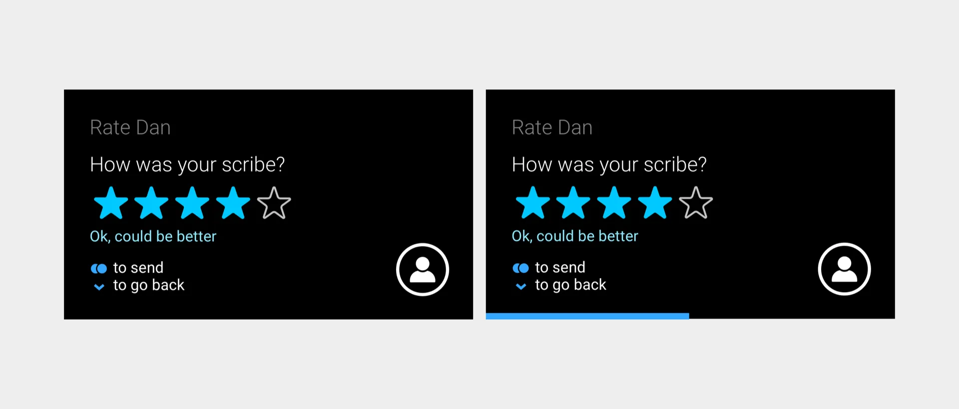
Intentional friction. In order to reduce faulty rating submissions, I introduced some friction into the rating process. Instead of tapping to submit the rating, I experimented with gestures such as the double-tap and tap and hold. Unfortunately, the double-tap gesture proved just as faulty.
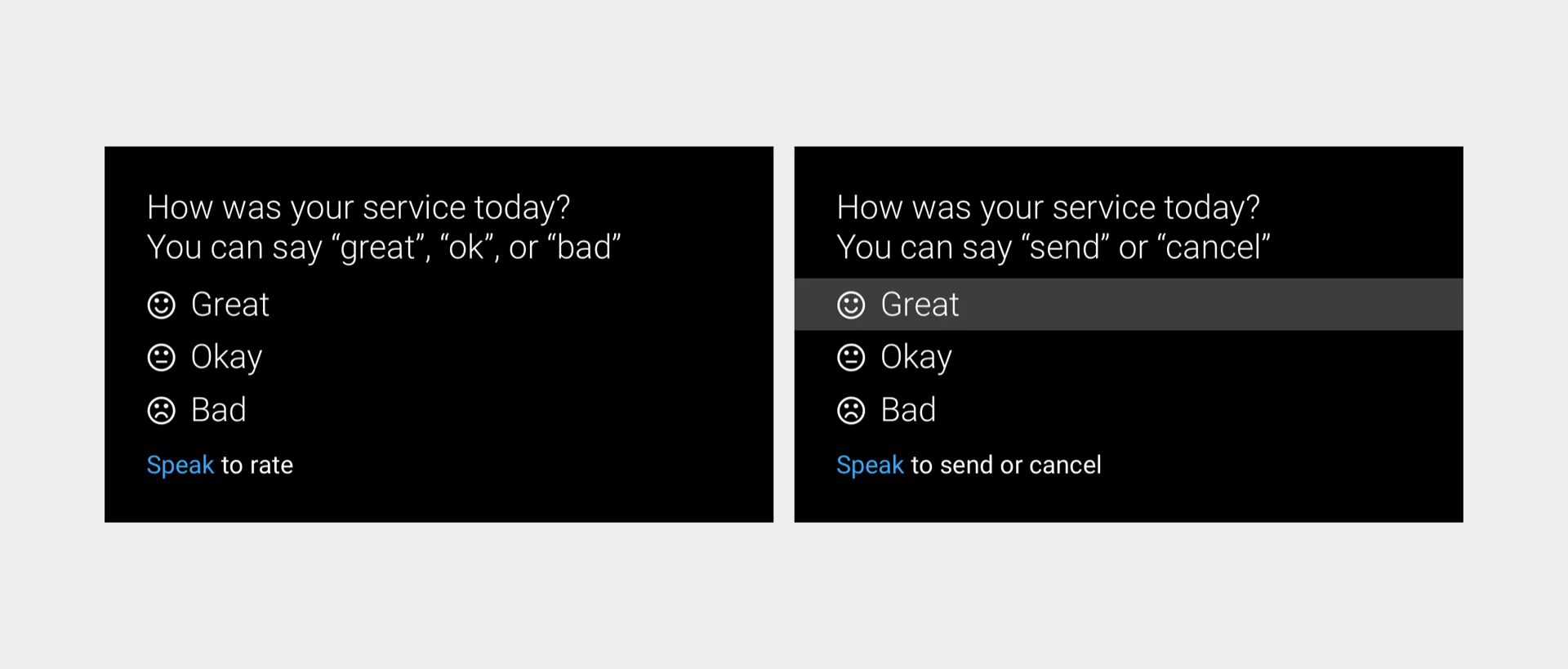
For fun, I also had engineering build two more prototypes to see if we could use voice as a modality instead of touch.
And the winner is…
As you might know usually there isn’t one concept that comes out on top. Rather, different parts from different concepts prove useful.
To analyze the data I noted where participants struggled and where the experience felt smooth. I paid attention to sentiments like “that’s cool” or “that’s annoying” which helped me isolate issues and discover opportunities for delight.
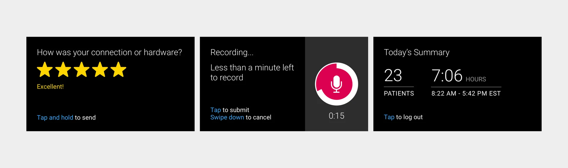
Finally I did a number of iterations taking the best parts of each and seeing how these parts hold up together (so as to avoid a Frankenstein).
Designing delight
Aside from polishing the visual experience, I also added some animation. When the viewer would swipe through ratings the stars would grow in size before settling into their normal state. This insight came from one of the participants who critiqued the swiping gesture as “too stiff”.
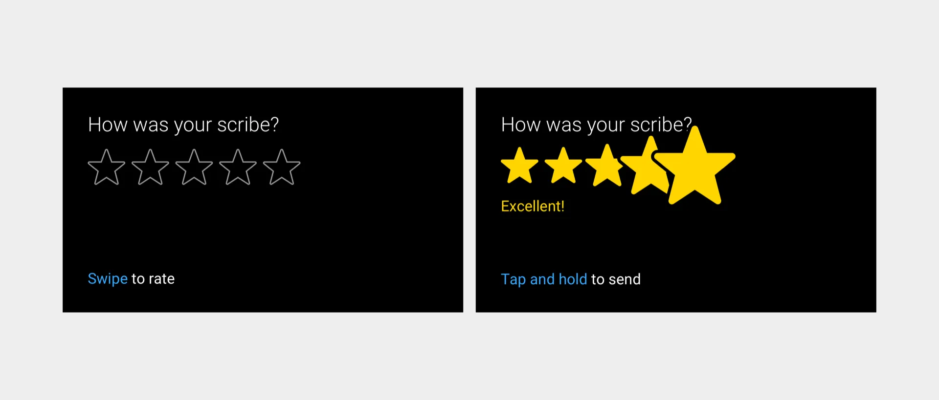
To address this feedback I wanted the motion to feel as natural and fluid as possible — as if the viewer is directly interacting with the UI. I worked closely with engineering to ensure this feature wouldn’t result in lots of custom code.
Outcomes and results
We rolled out ratings to a few doctors at first to test the waters letting them know of coming changes. Our goal was to inform them of the changes but also validate their feedback and get them excited.
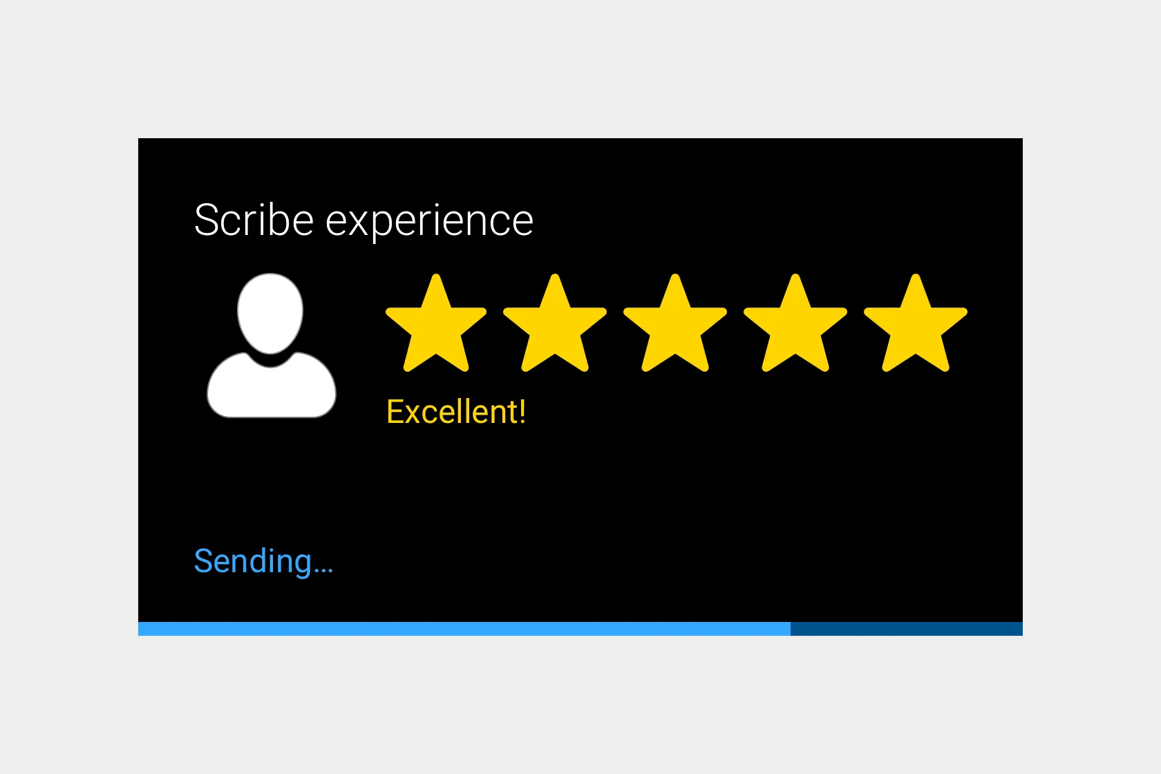
Here’s what one doctor said about the redesign,
“The subtle improvements make it appear like a higher-end product, I don’t know how to explain it but it’s actually nice. The tapping to submit and holding a lot more intuitive, it’s better overall.”
I loved the fact that the additional touches through animation and even the friction itself felt “nice” and came off as a “higher-end product”.
Designing for the future, designing human first
The world of digital design is in a state of flux. New platforms and new technologies are coming in on the scene all the time. Some of these also quickly fade into the background and others discover a new home. Such was the case with Google Glass moving from consumer to enterprise.
Perhaps the platforms you’ll be designing for in the future will look very different from today. If that’s the case, that’s ok because our core design methods serve us well — we still have to do our research and design human first and tech second.
I hope this article inspired you to consider working on new platforms and pioneer new interactions. After all, the best way to predict the future is to design it yourself.